Brass Mobile Redesign: From Drop-off to Daily Use
A mobile-first redesign that revived 60% of inactive users and boosted MoM retention by 40% — without shipping a single new feature.
Brass Business
Context
Brass offered a robust web platform for African SMEs. But when the mobile app launched as a direct mirror of the web, adoption fell short — not due to lack of features, but lack of usability.
The challenge wasn’t about building more. It was about unlocking the value that was already there.
The Product Challenge
Engagement on mobile was dropping weekly
Feature adoption was low despite availability
Inactive users cited friction and confusion
Our Hypothesis
The problem wasn’t functionality. It was discoverability.
So we reframed the goal
Don't just redesign the app — rediscover its core value through the mobile lens.
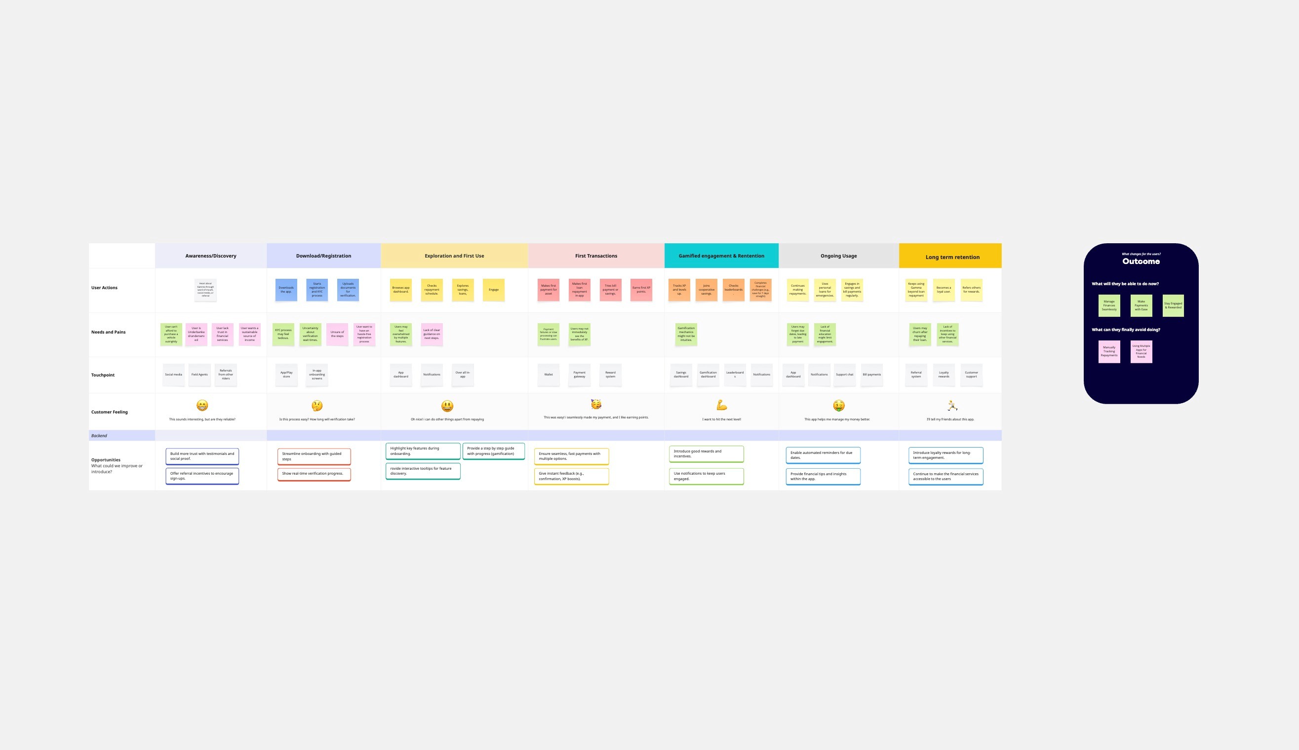
How We Moved
Spoke to 25 users (active + inactive). We mapped out:
Which financial tools were critical to their workflow
What frustrated them most about the mobile flow
Why they defaulted to web even when mobile was more accessible.
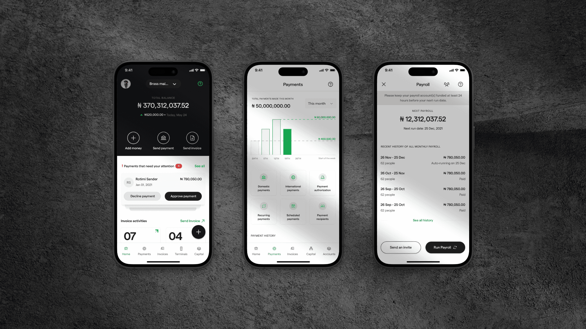
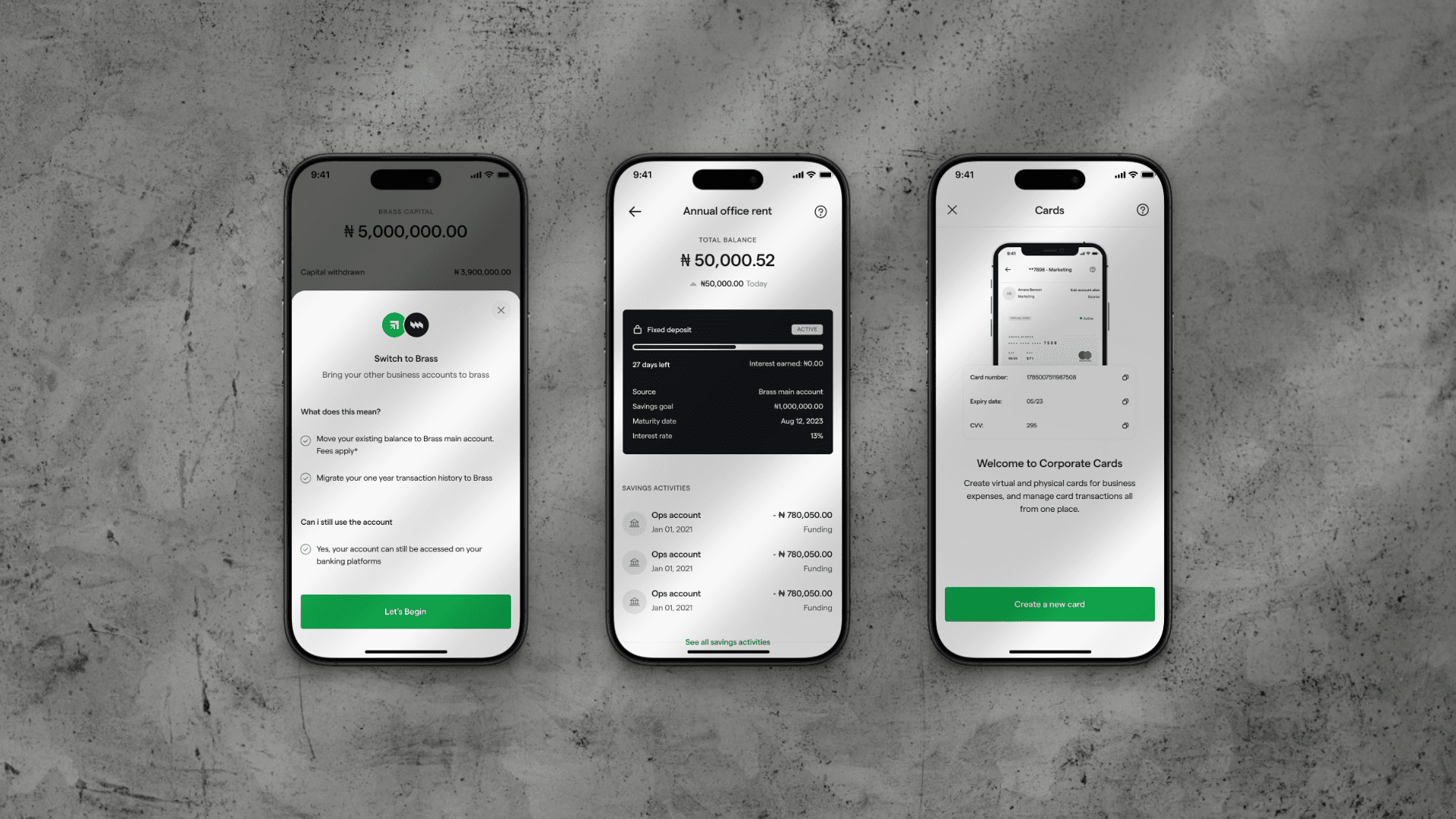
Prioritization by Usage Impact
We analyzed usage data and surfaced the 4 most business-critical tools:
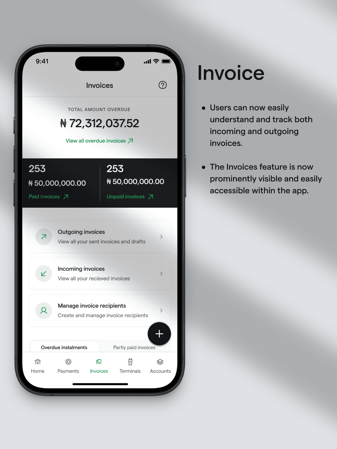
Invoicing
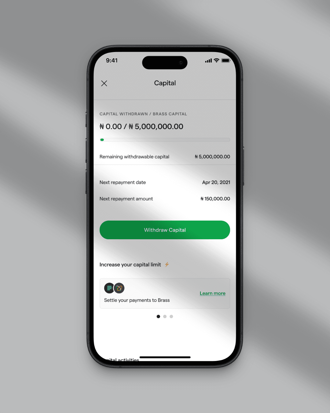
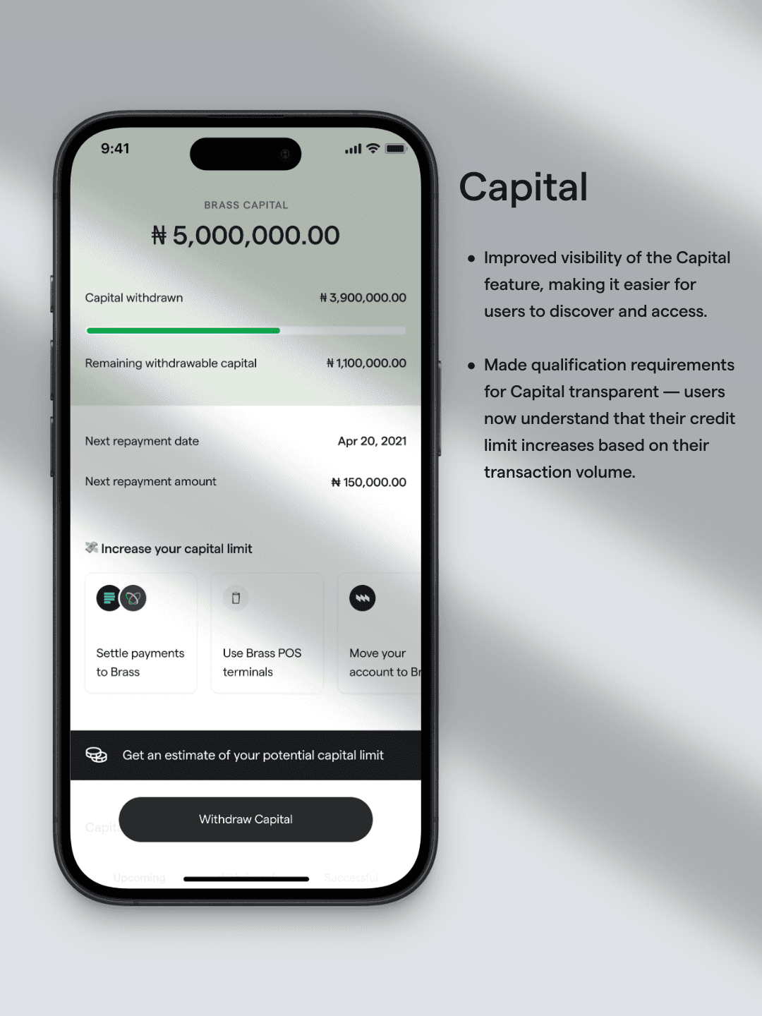
Capital
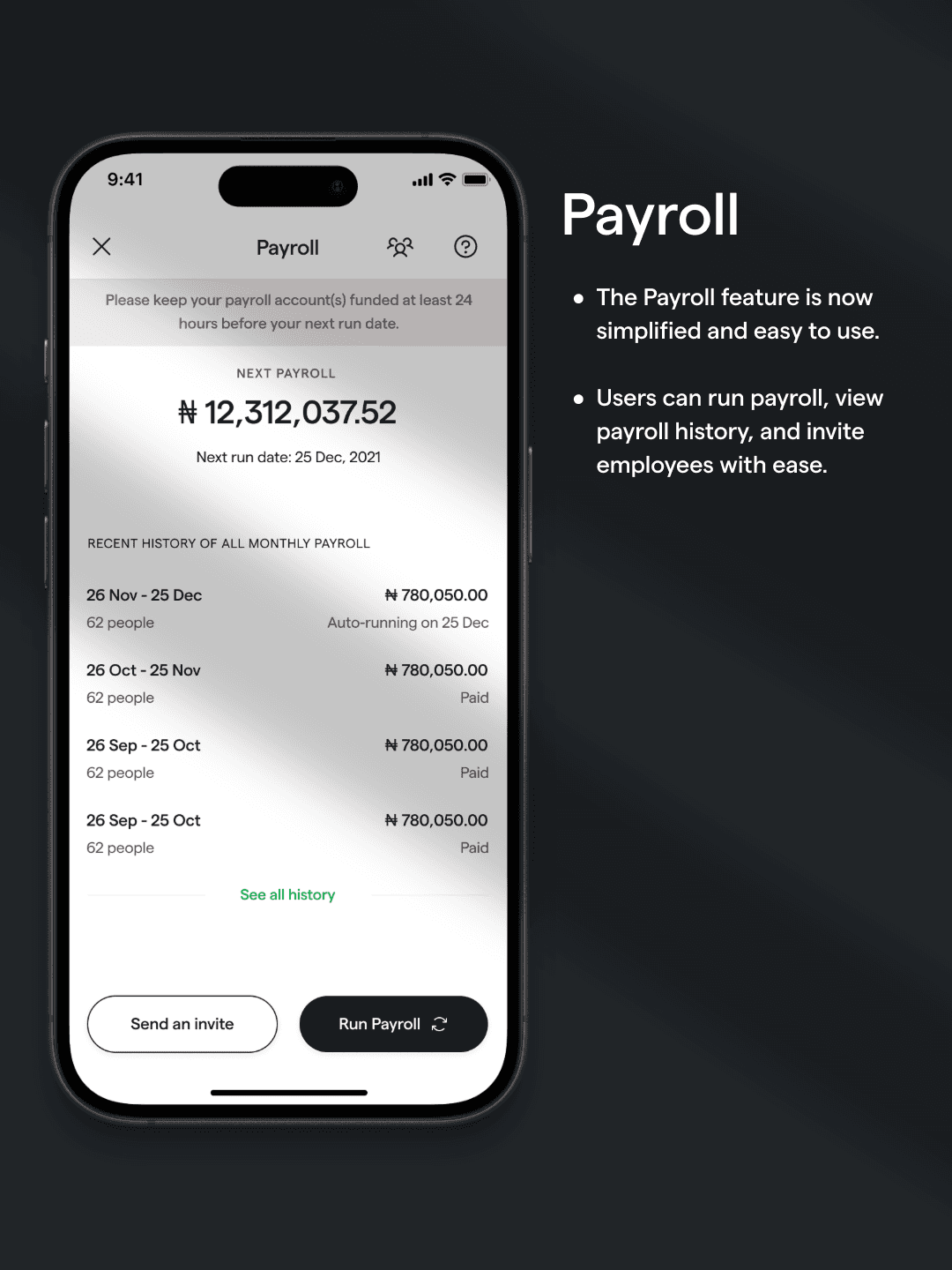
Payroll
Payment
Then restructured the mobile navigation around these.
We some tradeoffs:
We consolidated focus into 5 tabs from 4 tabs — even though this meant pushing some secondary tools to second-level screens. We chose depth over breadth to drive value clarity.
Rapid Prototyping & Continuous Feedback
Created focused prototypes
Ran weekly A/B tests with the same 25 users
Iterated based on comprehension, time-to-task, and delight scores

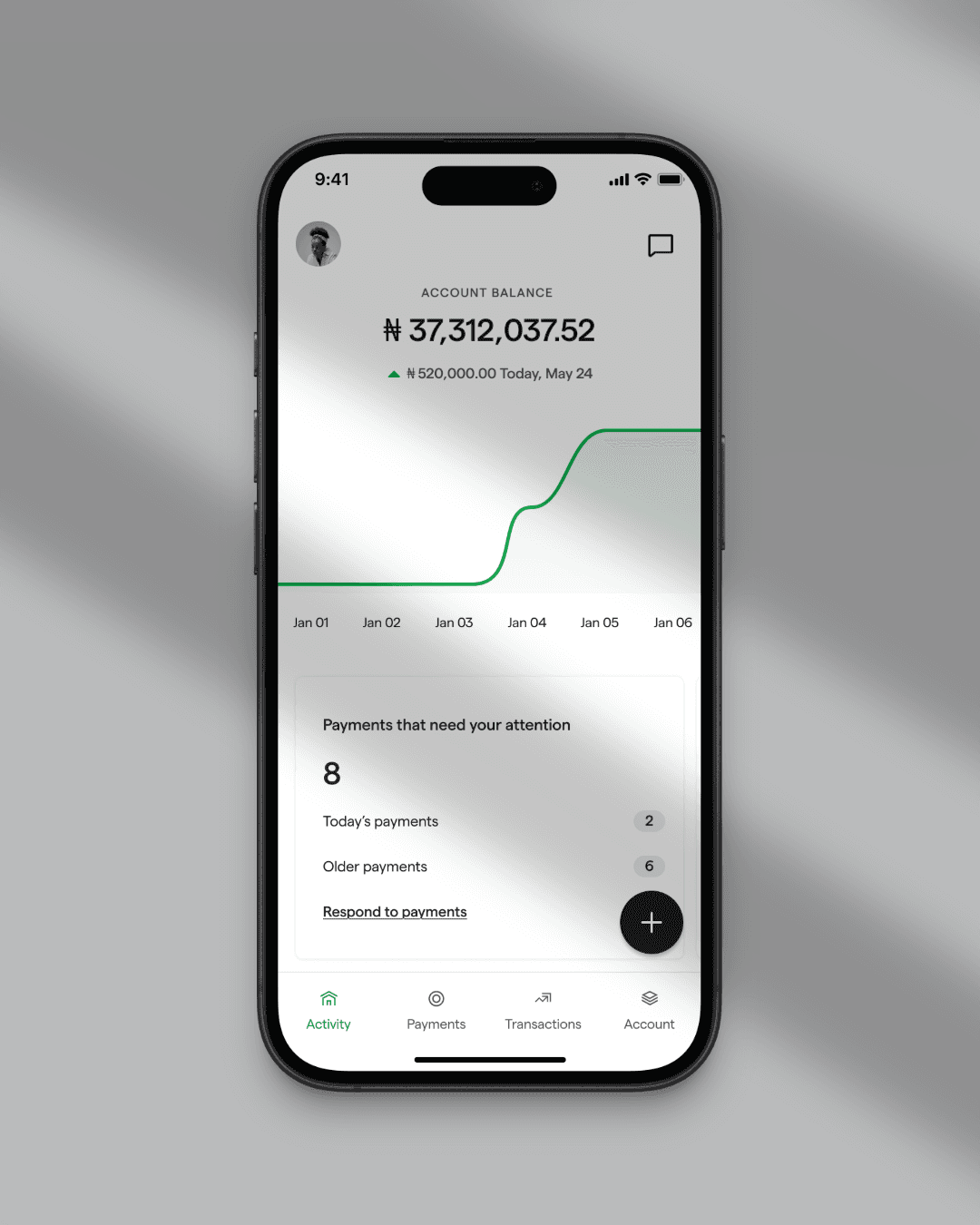
Screens from the mobile app redesign

40%
Month-over-Month Retention Growth
60%
Previously Inactive Users Returned
~$7M+
Transaction Volumes Hit 7 Figures MoM
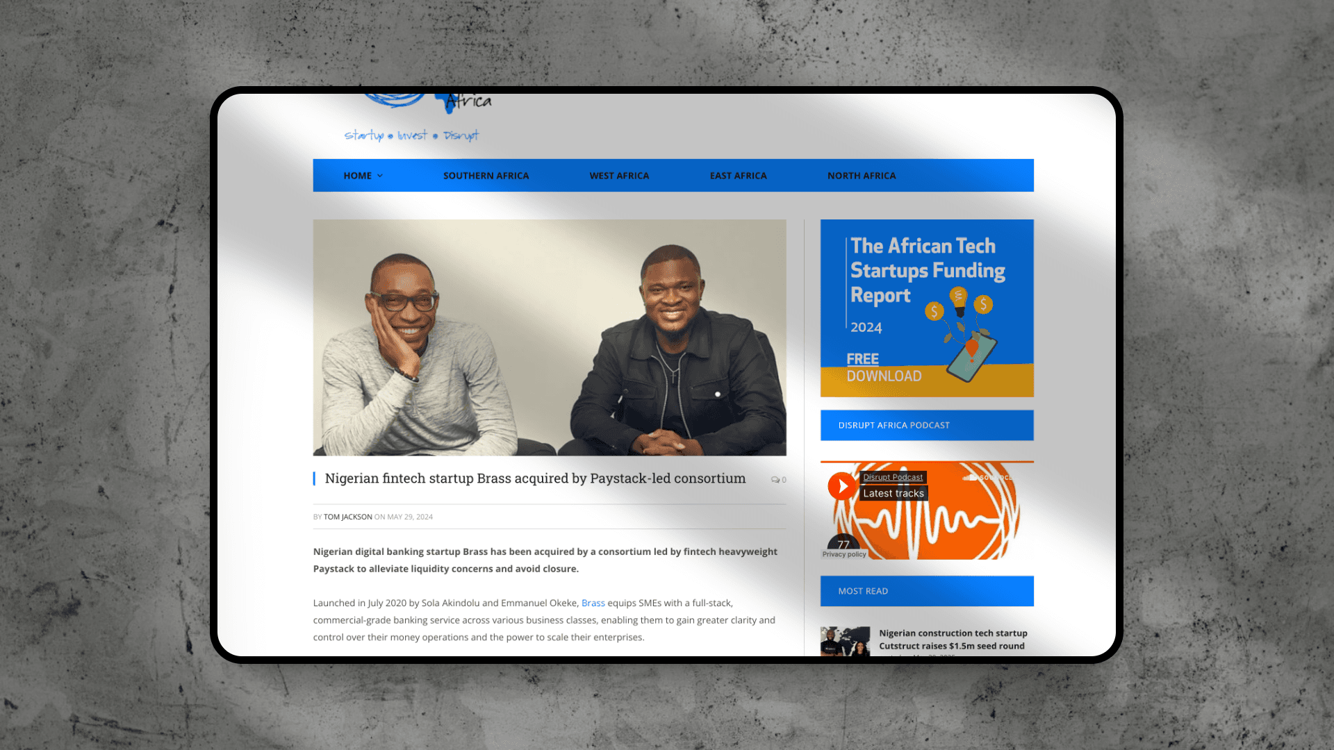
Positioned Brass for Acquisition by Paystack
The improved product performance — especially mobile growth and user retention — played a key role in Brass’s acquisition by Paystack, one of Africa’s leading payment gateways. Our work proved Brass could drive sustainable user engagement and revenue, strengthening its appeal as a strategic asset.
What Set This Apart
Product Thinking:
We didn’t try to do more. We made existing value usable.
Strategic Design:
We redefined what “mobile-first” meant for Brass — starting from user behaviors, not screen size.
Business Alignment:
Our redesign moved retention, revenue, and ultimately increased company valuation — helping set the stage for acquisition.
What I Learned
It also reinforced that great product design is measured in business movement, not pixels.