Redesigning Clafiya: From User Confusion to Meaningful Growth
Boosted retention by 40% and improved conversions by 75% by redesigning a fragmented healthcare platform into an intuitive, trust-driven experience.
Clafiya
Product design lead
Background
Clafiya is a healthcare platform offering 24/7 digital hospital services, HSAs (health savings accounts), and a network of wellness partners. After a strong launch, new features were layered in quickly—causing user confusion, dropping retention, and slowing acquisition.
The product needed to evolve from MVP chaos into a well-structured platform that users could trust and navigate with ease.
My Role
I led the full redesign of the Clafiya web app, aligning design with business strategy while ensuring the product met real user needs. I collaborated cross-functionally across product, engineering, and support.
Research & Planning
To guide our direction, I conducted foundational user research with both active and lapsed users. The goal was to uncover friction in their experience and inform our design decisions with real-world insights.
Approach
5 in-depth user interviews via Google Meet
Contextual inquiry into how users managed healthcare needs
Heuristic review of the existing flow
Internal stakeholder alignment sessions
What We Investigated
Who our users are and their digital behaviors
How they booked healthcare services today
What made them drop off during key flows
Their understanding of HSAs and financial health
Key Insights
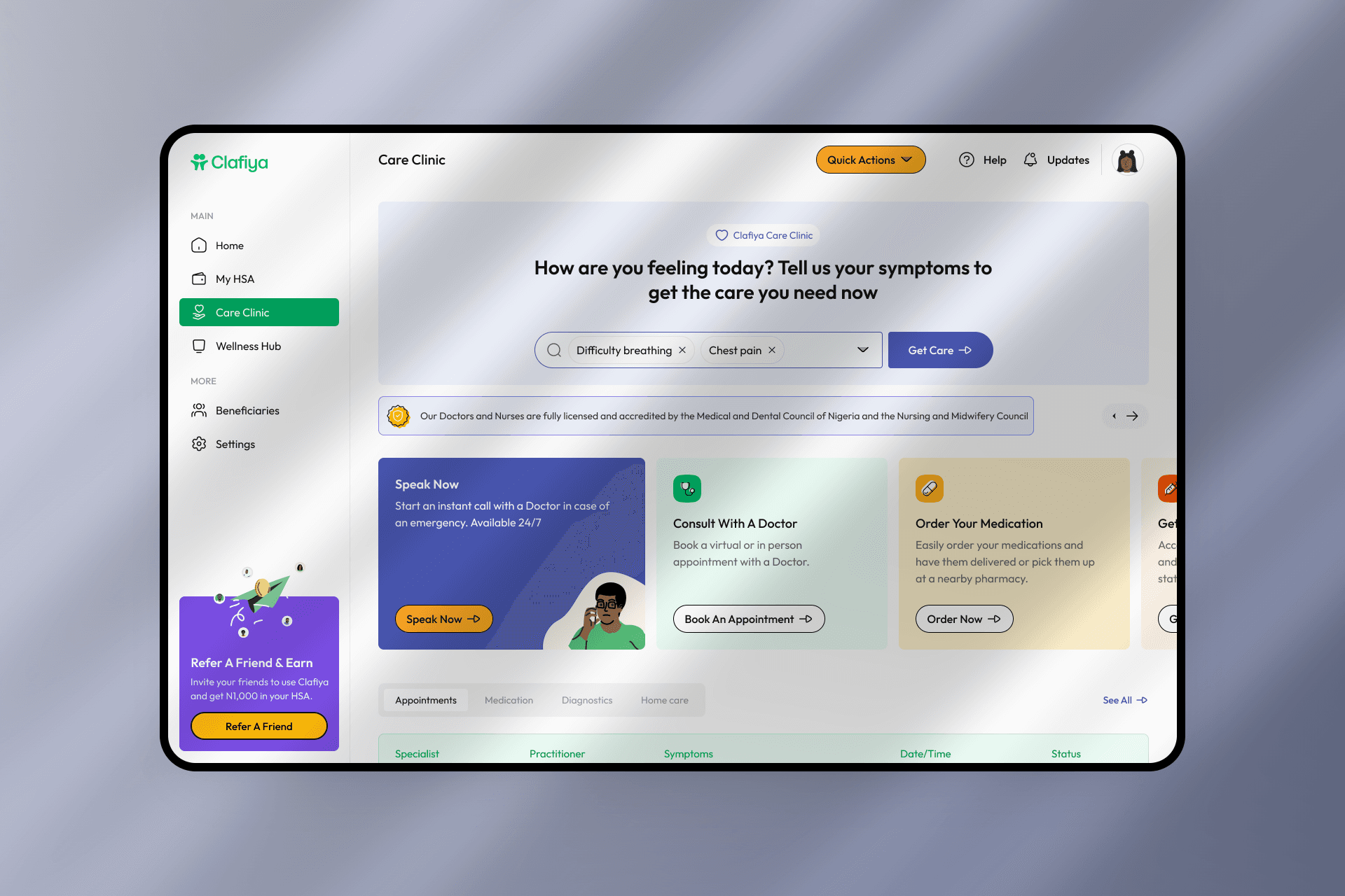
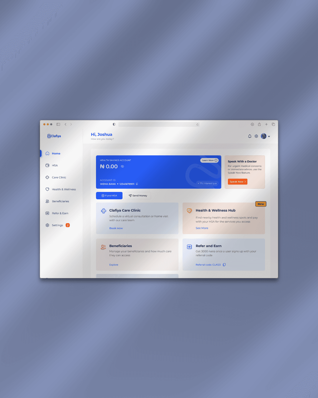
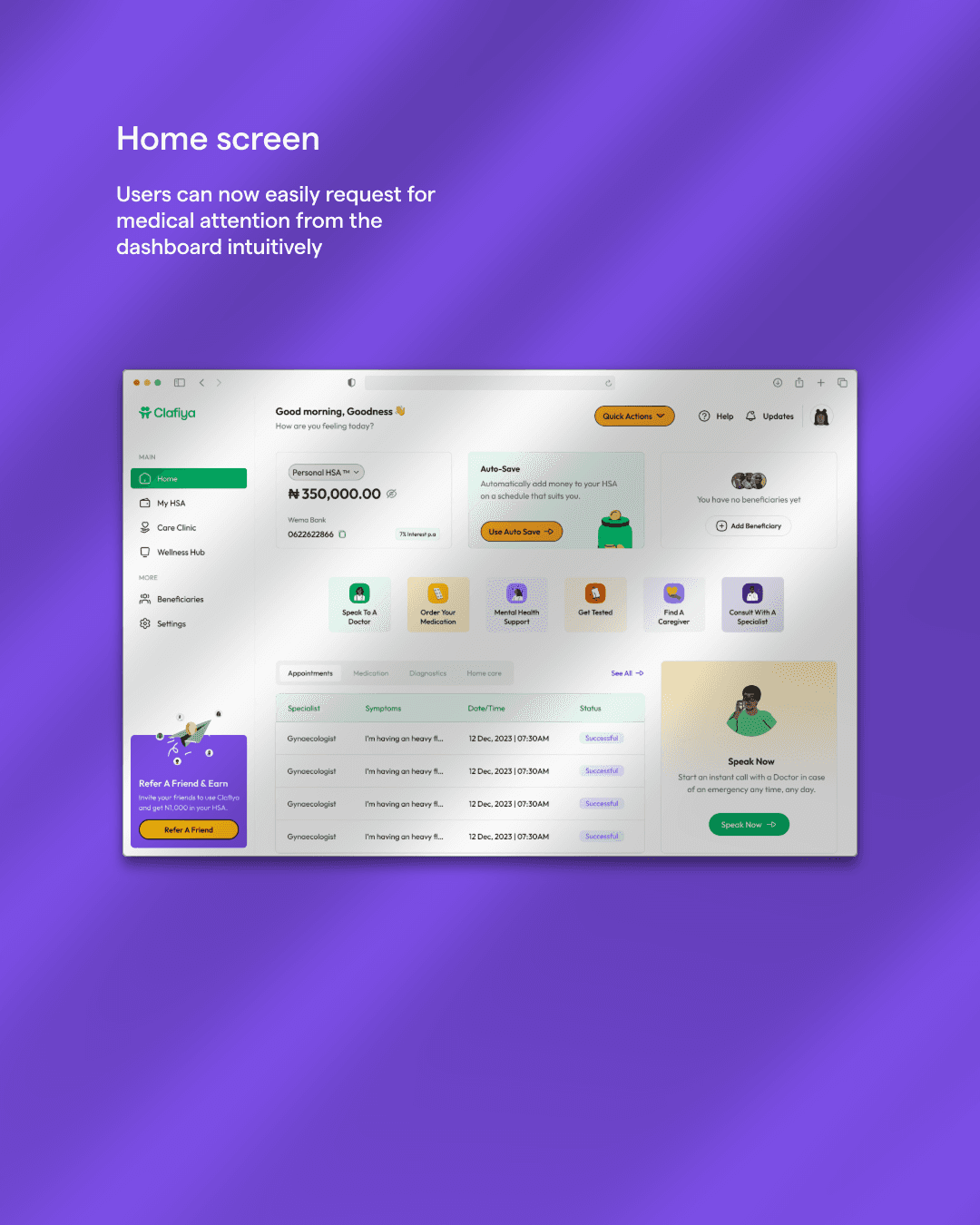
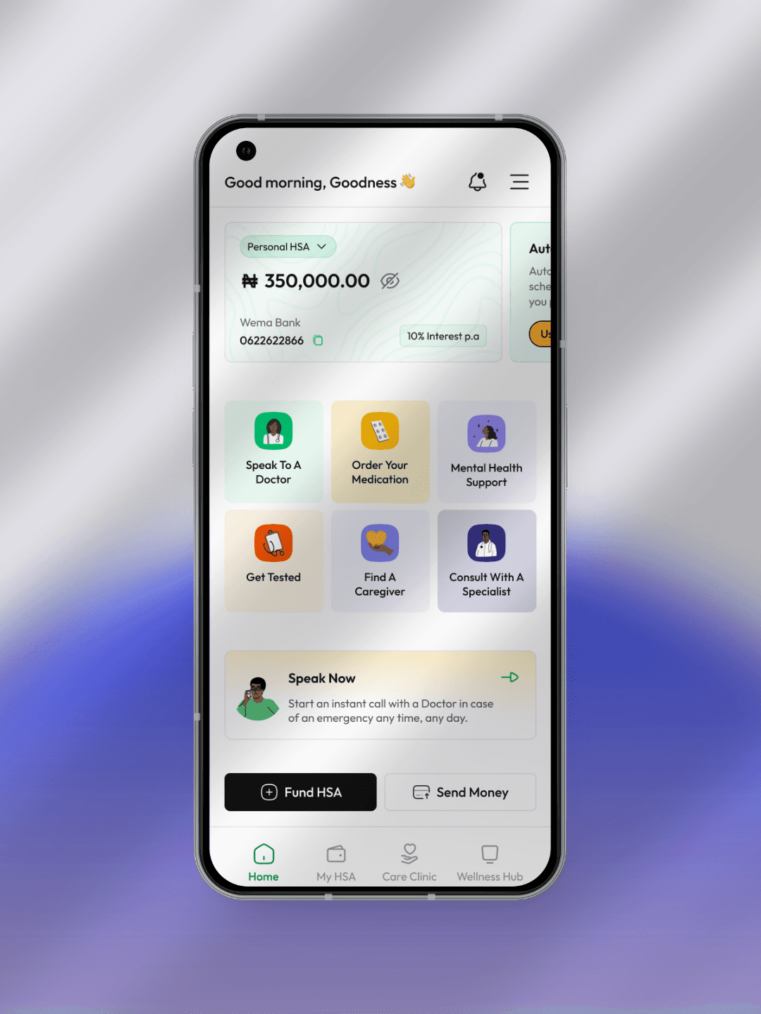
Users were unsure what to do next when they logged in—navigation felt overwhelming
Many were frustrated by being redirected to WhatsApp to complete basic actions
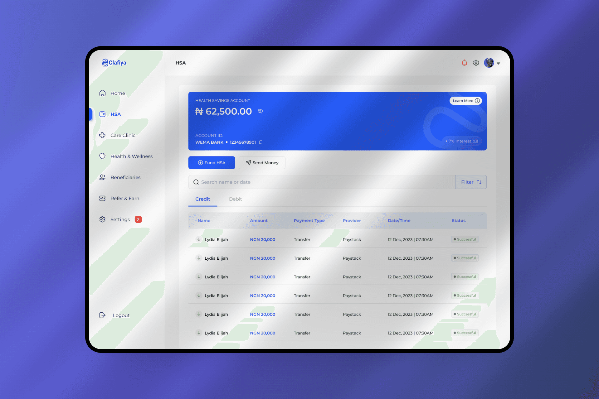
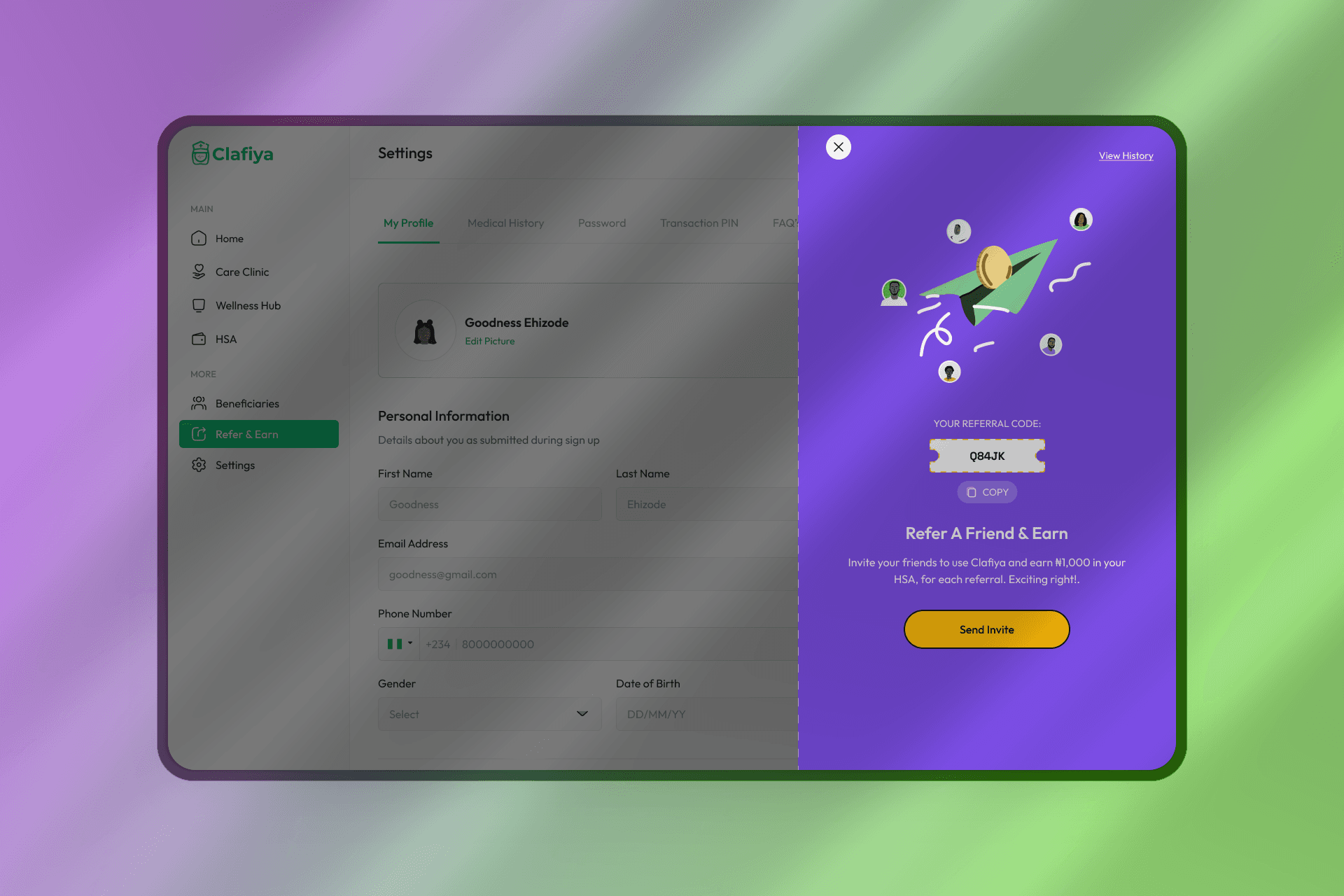
Users didn’t understand the benefits or mechanics of the HSA feature
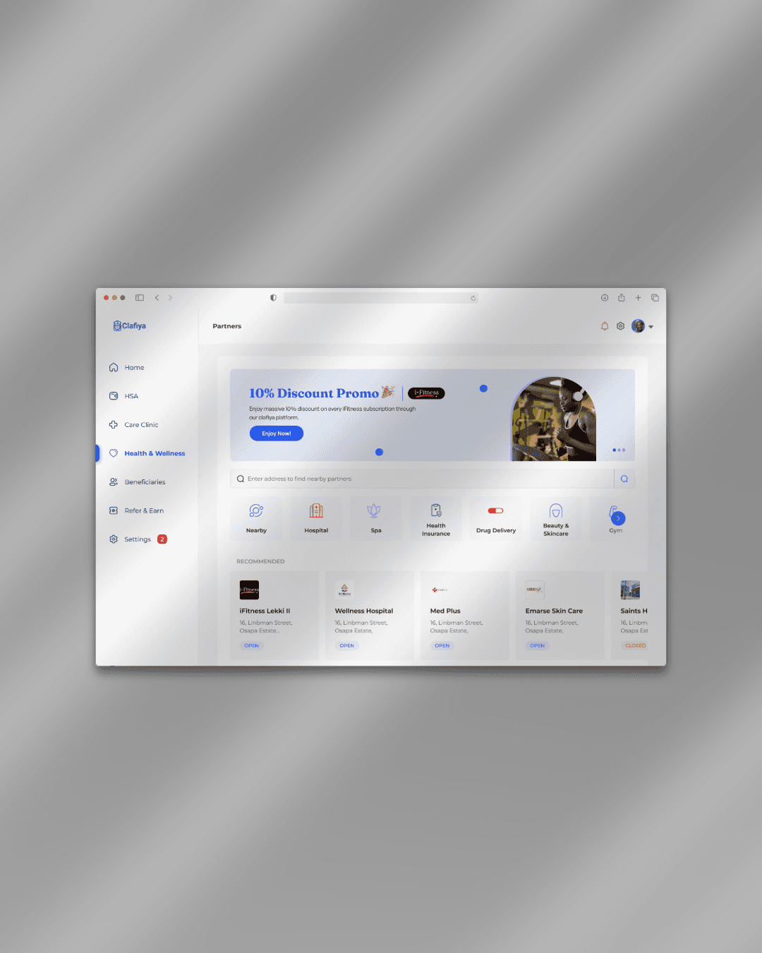
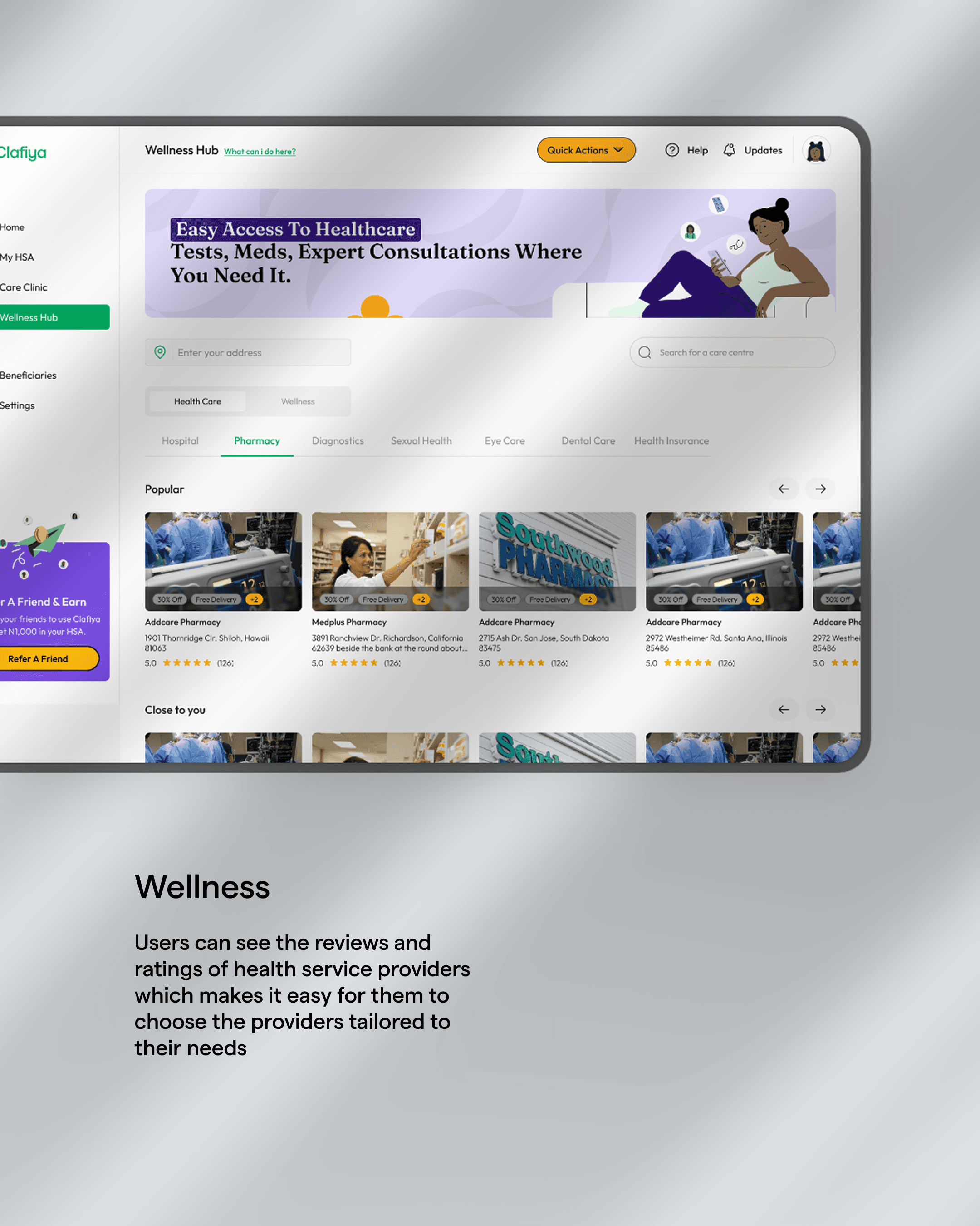
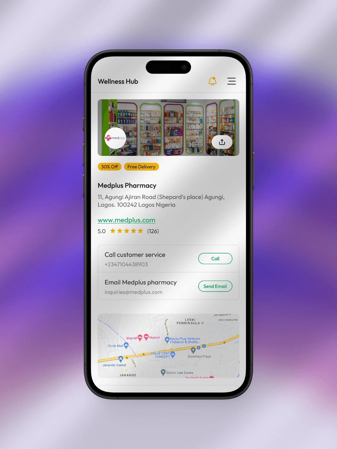
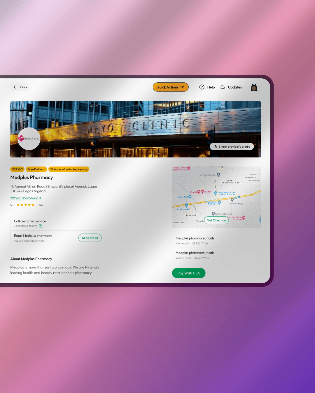
There was no way to filter or compare service partners, leading to distrust
The booking experience didn’t allow specialist selection—limiting control
Testing & Optimization
We launched a closed beta with returning users and previous churned users. We observed how they navigated the new flows and gathered feedback through follow-up interviews and surveys.
Outcomes from Testing
Users reported less confusion and increased trust
The onboarding time was reduced by ~50%
We refined language and visual cues for clarity
Improved discoverability of appointment and HSA features

40%
Retention MoM
75%
Increase in appointment and medication conversion
2.5x
Growth in HSA deposits within 6 weeks of relaunch
What I Learned
This project reminded me that user-centered design isn’t just about solving usability—it’s about building trust. Healthcare is sensitive, and users need clarity, control, and confidence.
By combining product simplification with education and smart UX flows, we gave users exactly that—and helped Clafiya regain growth momentum.